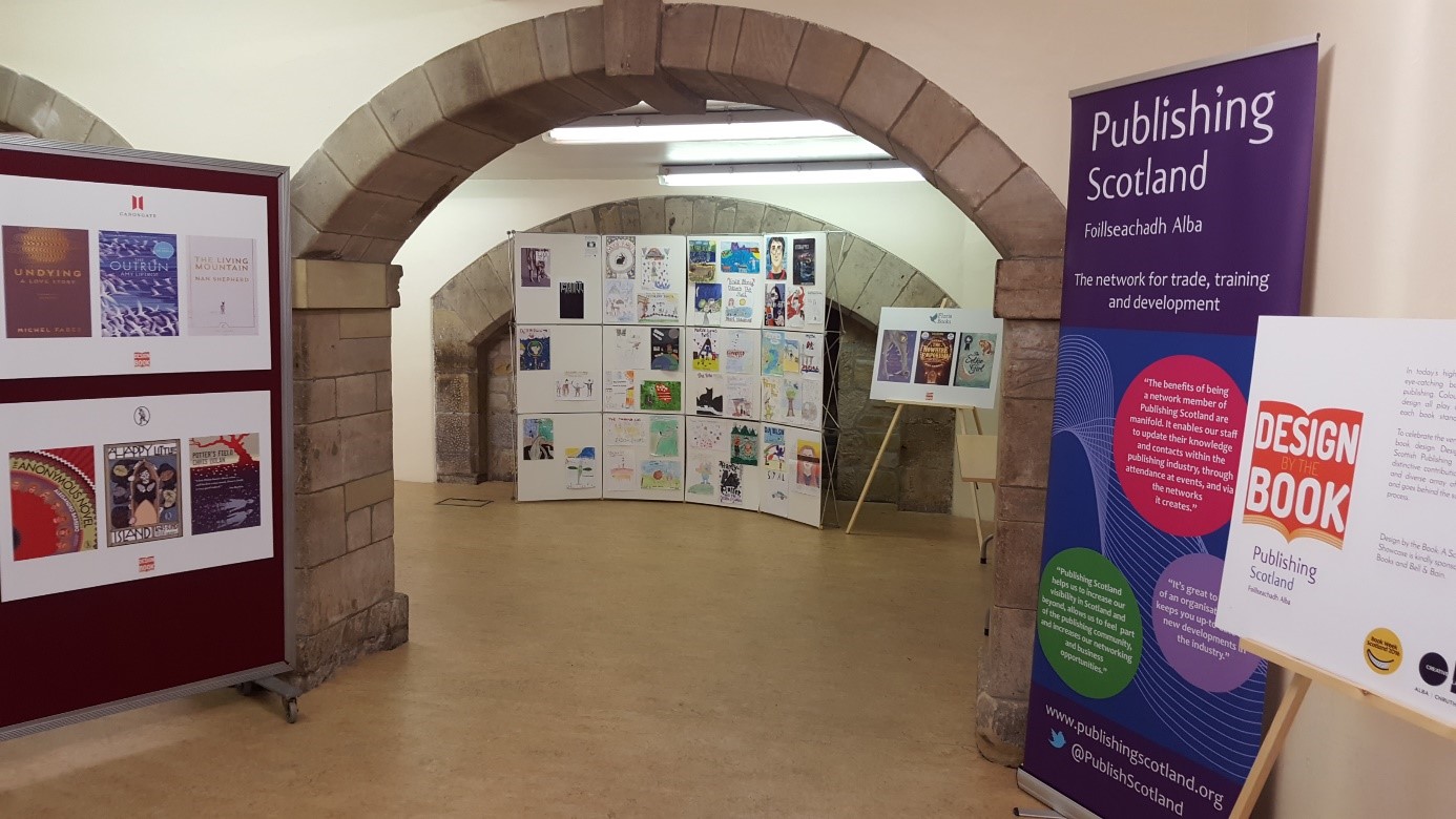
 Suzanne Dean, the creative director for Penguin Random House, took the stage at this year’s Scottish Book Trade Conference to tell us all that, against a childhood’s worth of well-intentioned advice, we should, in fact, judge a book By Its Cover. Although much of her advice will be familiar to most of us at Stirling University from our design classes like all good advice it doesn’t hurt being repeated, and there was also much which was new and just as helpful. She was also able to offer an insightful and oftentimes very funny first-hand account of the frustrating, nerve-wracking, but ultimately fulfilling world of book cover design.
Dean was the one responsible for the Vintage logo update and some of her cover designs may be familiar to many of us, especially the work she did for Haruki Murakami’s novel. The simple, yet eye-catching, black white and red circle designs quickly became quintessentially Murakami. But, as any good designer will tell you, break your own rules. Dean certainly did, in an exceptionally well thought out way, by adding colour to Colorless Tsukuru Tazaki.
With quite a hefty bit of experience under her belt Dean is more well-versed than most on what effective design must be. Namely eye-catching, engaging to a reader, and thought provoking. After all, as Dean reminded us, we only have a few seconds in which to catch a browser’s eye and encourage them to pick our book up over all the others. In today’s world where books are increasingly becoming commodities like any others, sold on shelves between groceries and cleaning products, good cover design is more important than ever.
Through her work with Vintage Classics Dean is very well aware of this. Not only are classic books subject to the same fight for attention that new ones are,  but they have a further added problem. As Dean asked, how do you convince someone to buy a book that’s probably freely available online?
Dean’s answer was simple.
By making them beautiful and desirable collectable objects.
Dean also found that a cover which hints at the contents receives a better reception than one which spells them out too heavily. Remember, with classics, the potential buyer has probably already read it, or at least is aware of the general plot, and so are more prone to spot and appreciate any little subtleties in the cover which, with a new novel, might only be appreciated after being read.
Of course, even while the contents of these classic books are well-known and familiar to many it is as important, if not more so, to keep the covers fresh and new. With content that has so many past covers it’s important not to become too similar. With their new Vintage Future editions Dean has managed to avoid this very pitfall. Using only a sheet of acetate and some line based designs this set of nine futuristic classics feature animated covers. The bold colours and psychedelic shapes combined with the animated feature and juxtaposed against the classic, black bordered layout perfectly capture the essence of these texts which, although written in the past, were always looking far into the future.
This seems to be a key theme brought by Dean to all her covers. Whilst they vary widely, and are each intricately tailored to suit their contents, there appears to be an emphasis on keeping them relevant, not just to our times but to all times.
But to achieve such beautiful, evocative, and timeless designs there is first a long process which must be traversed. As Dean revealed, one of her covers went through over seventy redesigns before it was finally accepted. It can also be very difficult to read a manuscript with the expectation upon you that a beautifully designed cover will simply emerge fully formed from your head. You must ‘rely upon the spark to happen’ and to keep on happening the next time and the next and the next. You must experiment, and engage with all forms of media. As Dean put it, ‘go out and see things,’ as many things as possible. You never know where inspiration will next come from.
And, most importantly, practice. For designers ‘just like dancers’ must practice before they can create something beautiful.
By Caroline O’Brien